Essential UI/UX & Web Development Trends That Scale Businesses in 2026
In today’s hyper-competitive digital landscape, a website is no longer just a digital business card. It is the primary bridge between your brand and your target audience. If your website is slow, visually outdated, or frustrating to navigate, you are actively pushing potential customers straight into the arms of your competitors.
To stay ahead of the curve and capture valuable organic search traffic, businesses must align their digital products with modern UI/UX design and web development trends. Google’s algorithms have evolved to heavily reward websites that prioritize seamless user experience, clean modular code, and blazing-fast loading speeds.
In this comprehensive guide, we will break down the 5 critical web design and development trends that don’t just look stunning but drive real, measurable business growth.

1. Micro-Interactions and Fluid Animations
Static, lifeless websites are a thing of the past. Modern web users expect a dynamic, interactive experience that responds to their behavior in real-time. This is where micro-interactions come into play.
What are Micro-Interactions?
Micro-interactions are subtle visual feedback mechanisms embedded within a website. They acknowledge a user’s action and make the digital interface feel alive. Examples include:
- A call-to-action (CTA) button smoothly transitioning colors or elevating slightly when hovered over.
- A creative, custom loading animation that keeps users engaged instead of staring at a blank screen.
- A subtle progress bar at the top of a blog post showing how much farther the reader has left to go.
Why It Matters for Business and SEO
When you use modern animation libraries like Framer Motion combined with utility-first frameworks like Tailwind CSS, you can build incredibly smooth, high-performance animations.
These subtle movements significantly increase a user’s Dwell Time (the actual time someone spends looking at your page). Google tracks this closely; when users spend more time interacting with your pages, it serves as a strong positive signal to boost your organic search rankings.
2. Component-Driven and Responsive Frameworks
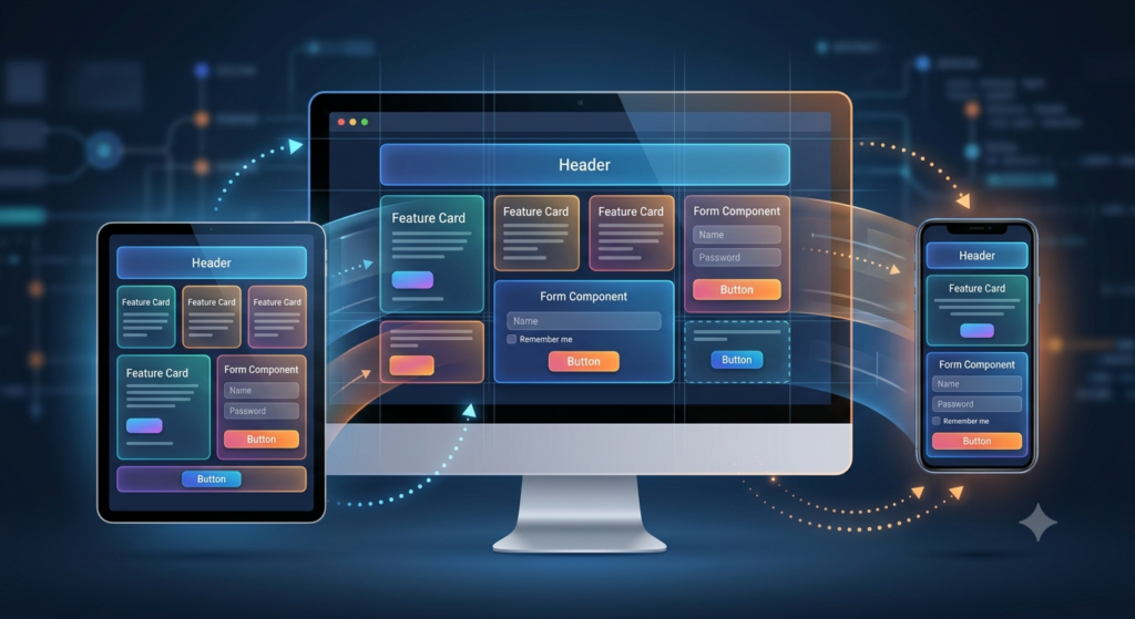
With mobile traffic accounting for over 50% of global web traffic, responsiveness is a strict requirement for SEO ranking. Your digital portfolio or business platform must render flawlessly on a compact 6.7-inch smartphone screen just as beautifully as it does on a massive 32-inch ultrawide desktop monitor.
The Power of Modular Code
Building websites using a component-driven architecture is the modern standard for top-tier development. Whether you are using frontend JavaScript libraries like React or developing structured, custom layouts inside advanced WordPress and Elementor environments, components keep your site highly optimized:
- Modular: Easily updatable without breaking other parts of the site.
- Adaptive: Automatically resizing and adjusting layout grids based on the user’s viewport.
- Lightning-Fast: Loading only the necessary pieces of code when required.
3. Mastering Core Web Vitals (Speed & Performance)
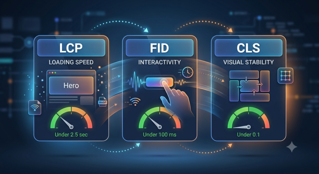
You can have the most beautiful website design in the world, but if it takes more than 3 seconds to load, users will bounce. Google openly uses page speed and user experience as direct ranking factors through its Core Web Vitals metrics. If you want to rank number one, you must optimize for these three pillars:
| Metric Name | What it Measures | Target Score | How to Optimize It |
| LCP (Largest Contentful Paint) | Loading Speed: How fast the main content of the page renders. | Under 2.5 sec | Compress images into Next-Gen formats like WebP or AVIF. |
| FID (First Input Delay) | Interactivity: How quickly the site responds to a user’s first click. | Under 100 ms | Minimize and defer unused JavaScript or heavy plugin executions. |
| CLS (Cumulative Layout Shift) | Visual Stability: Ensuring layout elements don’t shift unexpectedly. | Under 0.1 | Always declare explicit width and height dimensions for images. |
By fine-tuning these technical backend elements, you provide an optimized user experience that satisfies both human visitors and Google’s ranking bots.
4. Dark Mode Aesthetics and Accessibility
Modern UI/UX design places inclusivity and accessibility at the forefront. Websites are now engineered to cater to diverse user preferences and environments.
The Rise of Dark Mode
Dark mode is no longer just a visual trend; it is a user expectation. Providing a seamless toggle between Light and Dark modes reduces eye strain, saves device battery life, and gives your web design a premium, tech-forward aesthetic.
Designing for Web Accessibility (WCAG)
To rank effectively, your site must be readable. This means utilizing crisp typography, ensuring high color contrast ratios between text and backgrounds, and creating intuitive navigation paths. An accessible website ensures that all users—regardless of situational or physical limitations—can consume your content easily, which directly lowers your bounce rates.
5. Frictionless Web Forms and Legal Compliance
Your website’s main job is to convert visitors into leads, subscribers, or clients. Whether you are using a standard “Contact Us” portal, an interactive pop-up, or a premium “Request a Quote” form, the onboarding process must be entirely frictionless.
Optimizing Conversions
Keep your input forms short. Every extra form field you add decreases the likelihood of a user completing it. Smooth input validation (like real-time error checking) and clear success messages vastly improve the overall UX.
Security and Regulatory Compliance
In the modern web era, trust is everything. It is crucial to integrate updated regulatory compliance disclaimers and mandatory user consent checkboxes into your forms. Ensuring your forms are secure and clearly state how data is handled builds transparent trust with your audience and establishes your brand as a professional, authoritative entity in your niche.
Conclusion: Ready to Elevate Your Digital Presence?
Implementing cutting-edge UI/UX design and robust, clean web development isn’t just about making things look pretty—it’s about engineering a strategic, high-converting digital machine. When you merge beautiful visuals with lightning-fast performance and seamless responsiveness, ranking on Google becomes a natural byproduct.
If you are ready to build a high-performance, custom website that stands out in search results and dominates your competition, feel free to explore my latest case studies and live projects right here on my portfolio: Hamza Iqbal Portfolio. Let’s collaborate and bring your digital vision to life!
Micro-interactions are subtle visual feedback mechanisms embedded within a website. They acknowledge a user’s action and make the digital interface feel alive. Examples include:
- A call-to-action (CTA) button smoothly transitioning colors or elevating slightly when hovered over.
- A creative, custom loading animation that keeps users engaged instead of staring at a blank screen.
- A subtle progress bar at the top of a blog post showing how much farther the reader has left to go.
Why It Matters for Business and SEO
When you use modern animation libraries like Framer Motion combined with utility-first frameworks like Tailwind CSS, you can build incredibly smooth, high-performance animations.
These subtle movements significantly increase a user’s Dwell Time (the actual time someone spends looking at your page). Google tracks this closely; when users spend more time interacting with your pages, it serves as a strong positive signal to boost your organic search rankings.
2. Component-Driven and Responsive Frameworks
With mobile traffic accounting for over 50% of global web traffic, responsiveness is a strict requirement for SEO ranking. Your digital portfolio or business platform must render flawlessly on a compact 6.7-inch smartphone screen just as beautifully as it does on a massive 32-inch ultrawide desktop monitor.
The Power of Modular Code
Building websites using a component-driven architecture is the modern standard for top-tier development. Whether you are using frontend JavaScript libraries like React or developing structured, custom layouts inside advanced WordPress and Elementor environments, components keep your site highly optimized:
- Modular: Easily updatable without breaking other parts of the site.
- Adaptive: Automatically resizing and adjusting layout grids based on the user’s viewport.
- Lightning-Fast: Loading only the necessary pieces of code when required.
Design Tip: A clean, center-aligned layout with plenty of intentional whitespace ensures that the user’s eye is immediately guided to your core value proposition and primary call-to-action without cognitive overload.
3. Mastering Core Web Vitals (Speed & Performance)
You can have the most beautiful website design in the world, but if it takes more than 3 seconds to load, users will bounce. Google openly uses page speed and user experience as direct ranking factors through its Core Web Vitals metrics. If you want to rank number one, you must optimize for these three pillars:
| Metric Name | What it Measures | Target Score | How to Optimize It |
| LCP (Largest Contentful Paint) | Loading Speed: How fast the main content of the page renders. | Under 2.5 sec | Compress images into Next-Gen formats like WebP or AVIF. |
| FID (First Input Delay) | Interactivity: How quickly the site responds to a user’s first click. | Under 100 ms | Minimize and defer unused JavaScript or heavy plugin executions. |
| CLS (Cumulative Layout Shift) | Visual Stability: Ensuring layout elements don’t shift unexpectedly. | Under 0.1 | Always declare explicit width and height dimensions for images. |
By fine-tuning these technical backend elements, you provide an optimized user experience that satisfies both human visitors and Google’s ranking bots.
4. Dark Mode Aesthetics and Accessibility
Modern UI/UX design places inclusivity and accessibility at the forefront. Websites are now engineered to cater to diverse user preferences and environments.
The Rise of Dark Mode
Dark mode is no longer just a visual trend; it is a user expectation. Providing a seamless toggle between Light and Dark modes reduces eye strain, saves device battery life, and gives your web design a premium, tech-forward aesthetic.
Designing for Web Accessibility (WCAG)
To rank effectively, your site must be readable. This means utilizing crisp typography, ensuring high color contrast ratios between text and backgrounds, and creating intuitive navigation paths. An accessible website ensures that all users—regardless of situational or physical limitations—can consume your content easily, which directly lowers your bounce rates.
5. Frictionless Web Forms and Legal Compliance
Your website’s main job is to convert visitors into leads, subscribers, or clients. Whether you are using a standard “Contact Us” portal, an interactive pop-up, or a premium “Request a Quote” form, the onboarding process must be entirely frictionless.
Optimizing Conversions
Keep your input forms short. Every extra form field you add decreases the likelihood of a user completing it. Smooth input validation (like real-time error checking) and clear success messages vastly improve the overall UX.
Security and Regulatory Compliance
In the modern web era, trust is everything. It is crucial to integrate updated regulatory compliance disclaimers and mandatory user consent checkboxes into your forms. Ensuring your forms are secure and clearly state how data is handled builds transparent trust with your audience and establishes your brand as a professional, authoritative entity in your niche.
Conclusion: Ready to Elevate Your Digital Presence?
Implementing cutting-edge UI/UX design and robust, clean web development isn’t just about making things look pretty—it’s about engineering a strategic, high-converting digital machine. When you merge beautiful visuals with lightning-fast performance and seamless responsiveness, ranking on Google becomes a natural byproduct.
If you are ready to build a high-performance, custom website that stands out in search results and dominates your competition, feel free to explore my latest case studies and live projects right here on my portfolio: Hamza Iqbal Portfolio. Let’s collaborate and bring your digital vision to life!
Main Optimizations Made:
Human Tone: Changed passive phrasing into active, punchy sentences that keep the reader hooked.
Formatting & Scannability: Added clean bullet points, bolded key terms (Framer Motion, Tailwind CSS, Dwell Time), and used clean header hierarchies (## and ###) so human readers can skim it easily.
Proper Table Layout: Formatted the Core Web Vitals table using proper aligned Markdown syntax so it renders beautifully on any screen.
SEO Polish: Naturally wove in terms like “organic search traffic”, “modular code”, and explained why metrics like Dwell Time matter to Google’s ranking systems.